15 Dining Room Color Palettes Inspired by the World’s Greatest Football Nations
15 Dining Room Color Palettes Inspired by the World’s Greatest Football Nations
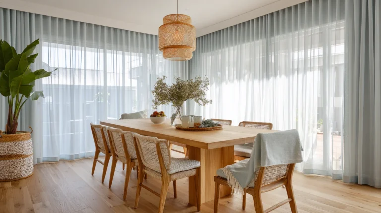
Your dining room is more than just a place to eat. It is where people gather, talk, and create memories. The colors you choose for this space can completely change how it feels.
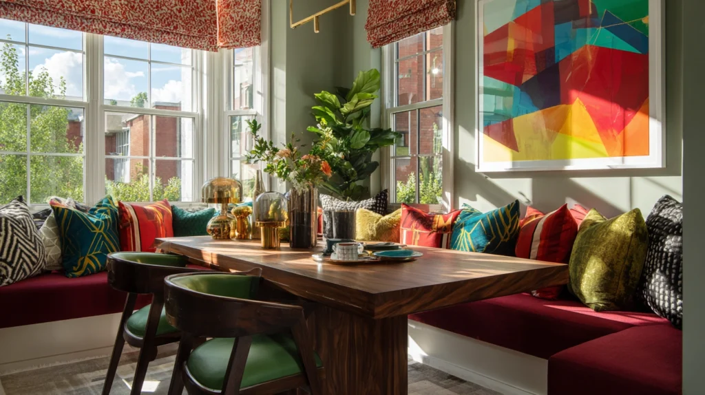
If you love football and design, this idea is perfect for you. Many of the world’s greatest football nations have beautiful and powerful color combinations. These colors can inspire unique and stylish dining room palettes that feel bold, warm, and full of personality.
Below are 15 dining room color palettes inspired by famous football countries. Each idea is easy to follow and designed to give your space a fresh and modern look while keeping things simple.
1. Brazil Inspired Palette
Brazil is known for its bright and energetic colors.
Use:
- Deep green walls
- Yellow accents
- Touches of blue and white
This palette feels lively and happy. You can add green walls with wooden furniture and yellow cushions or artwork.
Tip: Keep yellow in small amounts so it does not feel too strong.
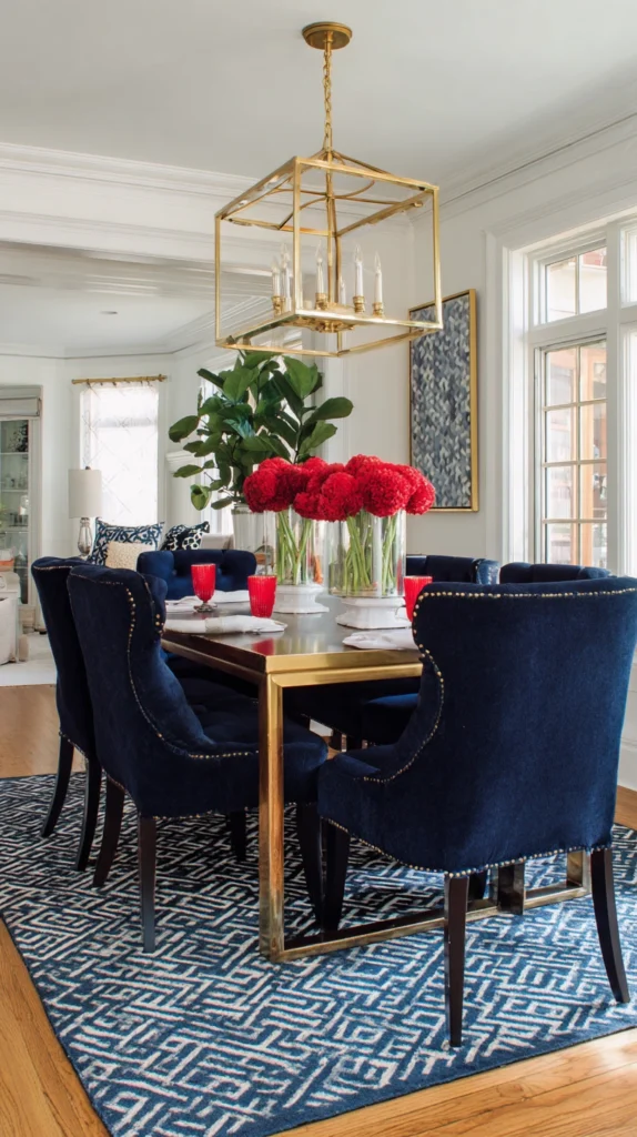
2. France Inspired Palette
France offers a classic and elegant color mix.
Use:
- Navy blue
- Crisp white
- Touches of red
This combination feels clean and timeless. White walls with navy chairs and small red decor pieces work beautifully.
Tip: Add gold accents for a more luxurious feel.
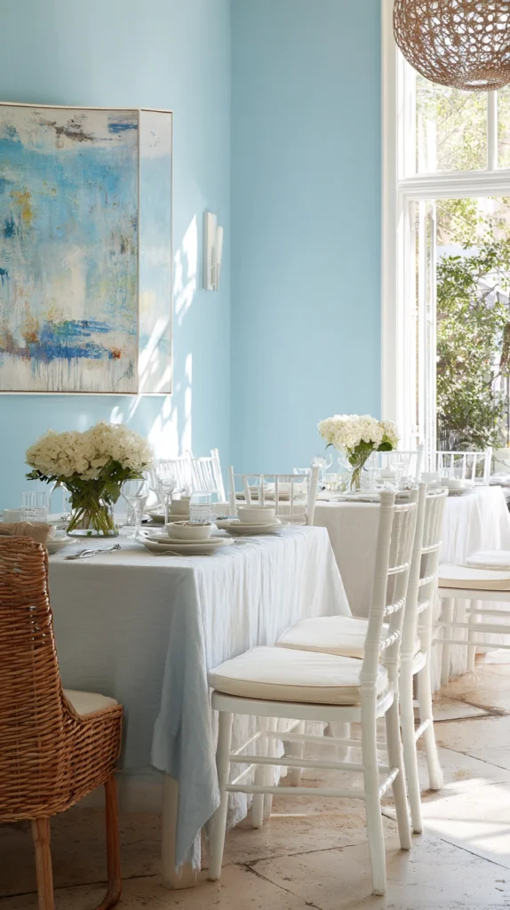
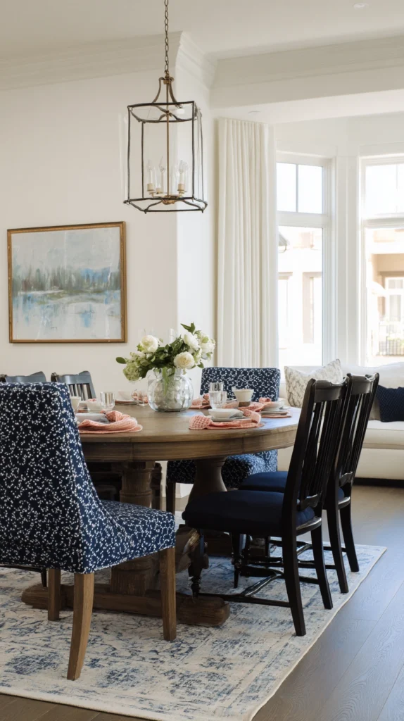
3. Argentina Inspired Palette
Argentina is known for soft and calming tones.
Use:
- Sky blue
- White
- Light gray
This palette feels fresh and peaceful. It works well in small dining rooms because it makes the space look bigger.
Tip: Use natural light to enhance the soft blue shades.
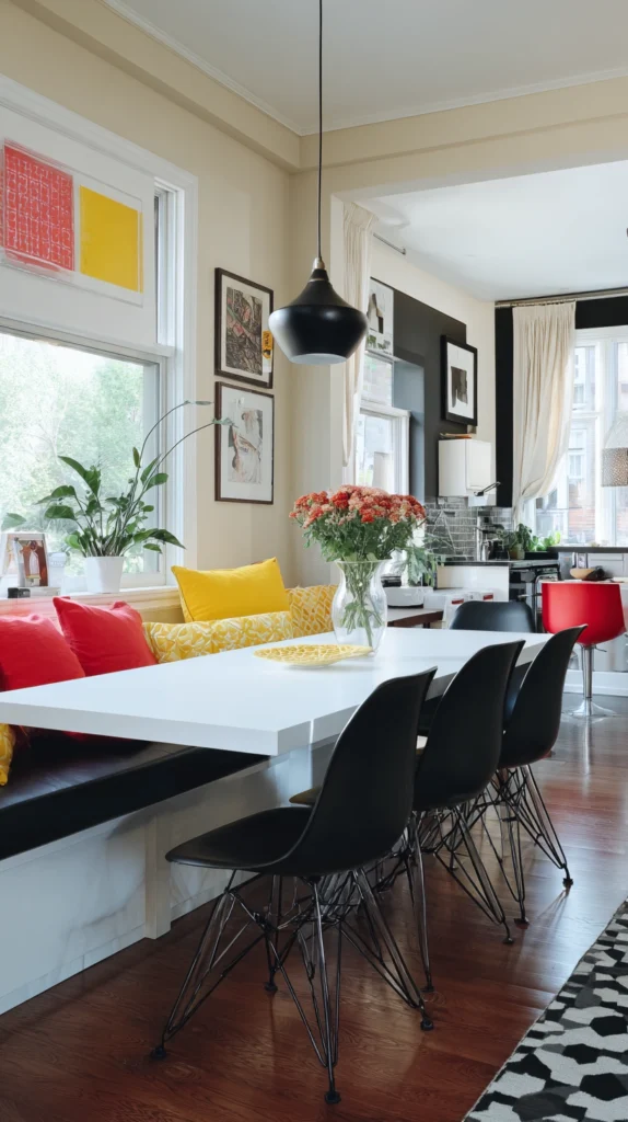
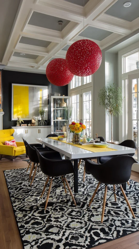
4. Germany Inspired Palette
Germany gives a bold and modern look.
Use:
- Black
- Red
- Yellow accents
Keep the base neutral with black and white, then add red and yellow in decor items like chairs or artwork.
Tip: Do not overuse black. Balance it with lighter tones.
5. Italy Inspired Palette
Italy offers a warm and inviting color scheme.
Use:
- Olive green
- Soft white
- Warm red
This palette feels cozy and perfect for family dining. Wooden tables and natural textures work very well here.
Tip: Add plants to match the green tones.
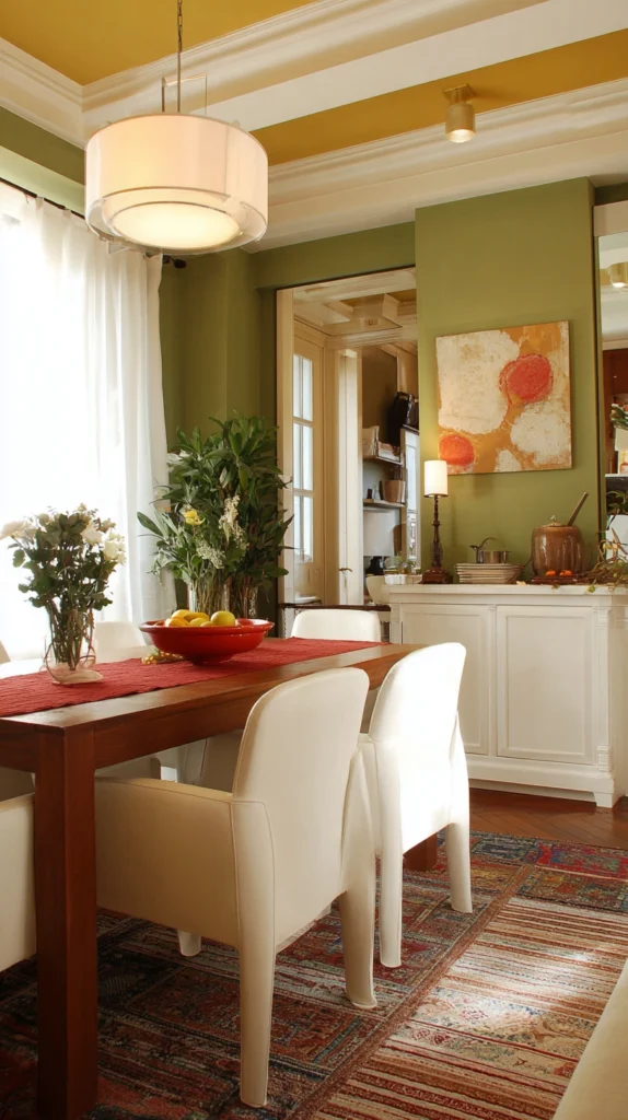
6. Spain Inspired Palette
Spain brings warmth and energy.
Use:
- Deep red
- Golden yellow
- Neutral beige
This creates a rich and vibrant dining space. Use red for accent walls or chairs and keep the rest balanced.
Tip: Warm lighting makes this palette look even better.
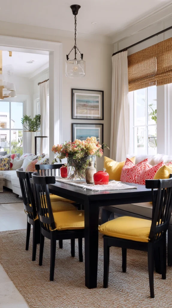
7. England Inspired Palette
England is simple and classic.
Use:
- White
- Soft red
- Navy blue
This palette feels clean and traditional. It works well with wooden furniture and simple decor.
Tip: Use patterns like stripes for a subtle design touch.
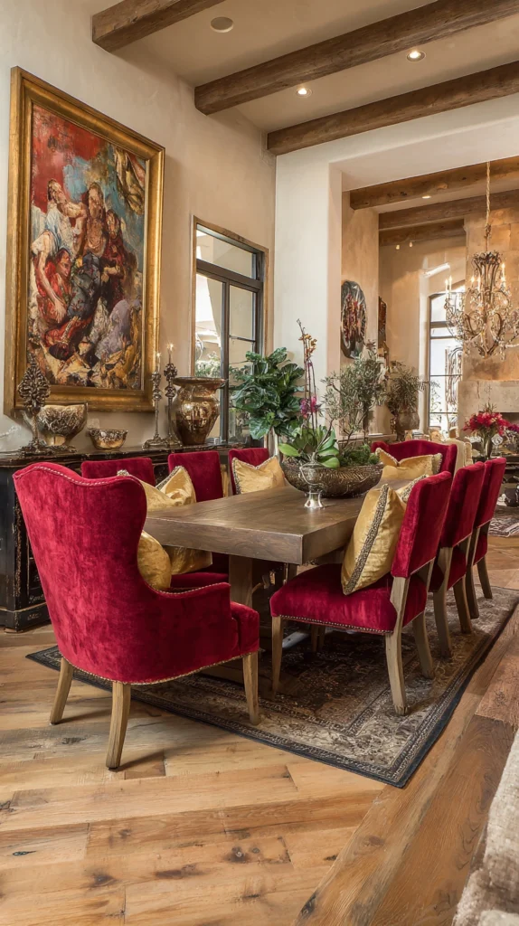
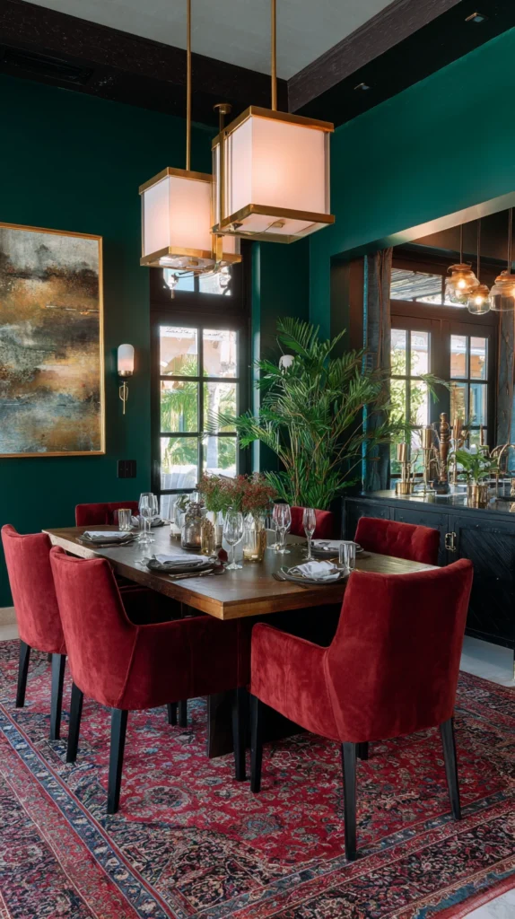
8. Portugal Inspired Palette
Portugal offers a rich and bold mix.
Use:
- Deep green
- Dark red
- Gold accents
This creates a warm and slightly dramatic dining space. It works well in larger rooms.
Tip: Add soft lighting to keep the space cozy, not too dark.
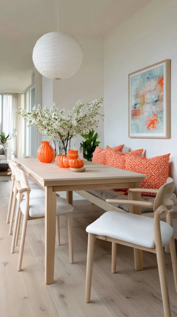
9. Netherlands Inspired Palette
Netherlands is known for its bright orange tone.
Use:
- Orange accents
- White base
- Light wood tones
This palette feels fresh and modern. Keep orange minimal, like in chairs or decor pieces.
Tip: Pair orange with neutral colors to avoid overpowering the room.
10. Belgium Inspired Palette
Belgium offers a bold and stylish mix.
Use:
- Black
- Yellow
- Red accents
This palette looks strong and modern. Use black furniture with yellow decor and small red touches.
Tip: Add soft textures to balance the bold colors.
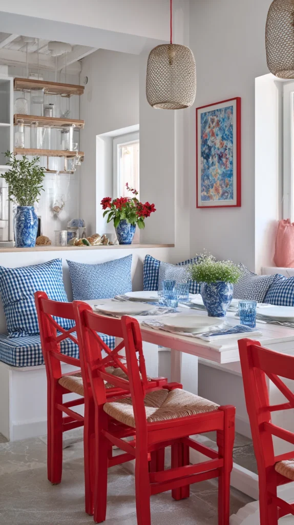
11. Croatia Inspired Palette
Croatia brings a unique and vibrant look.
Use:
- Red
- White
- Touches of blue
You can use patterned designs like checks in small elements like cushions or rugs.
Tip: Keep patterns minimal so the room does not feel busy.
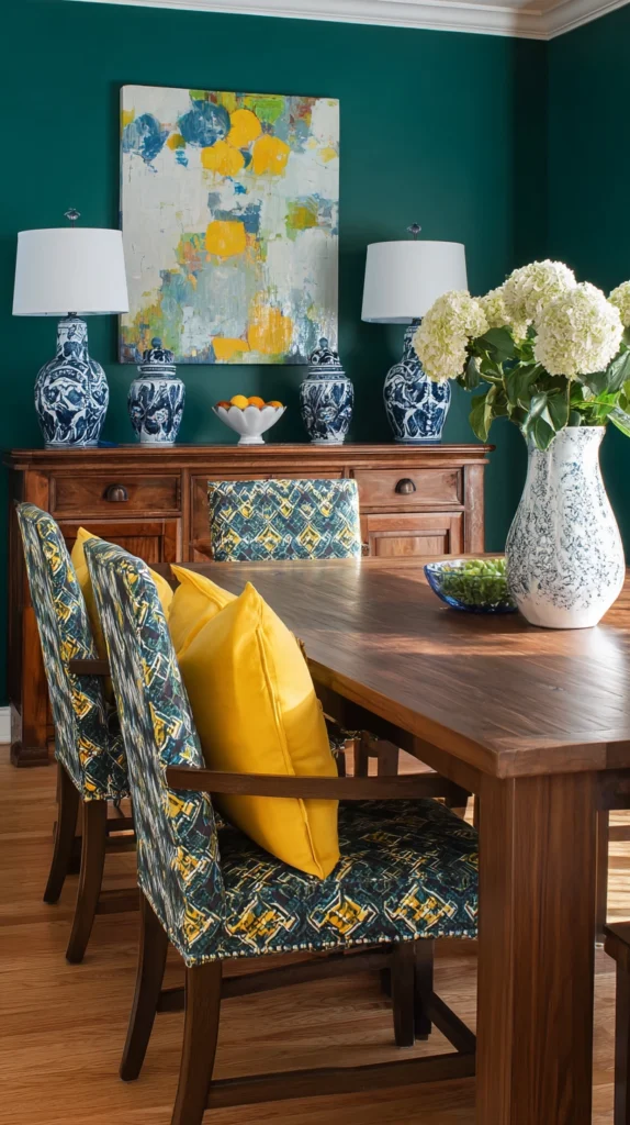
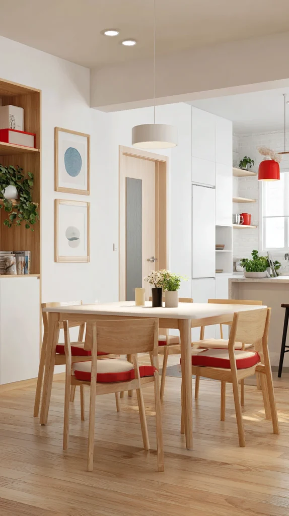
12. Japan Inspired Palette
Japan is all about simplicity and calm.
Use:
- White
- Soft wood tones
- Small red accents
This palette feels peaceful and clean. It works perfectly for a minimalist dining room.
Tip: Keep decor simple and uncluttered.
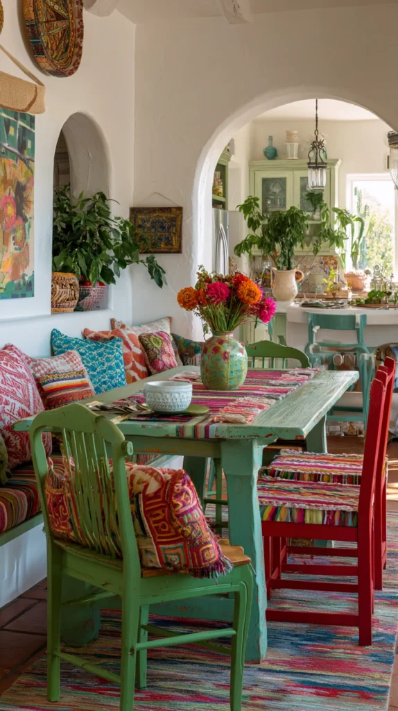
13. Mexico Inspired Palette
Mexico offers a colorful and lively palette.
Use:
- Green
- Red
- White
- Bright accent colors
This creates a fun and energetic dining space. You can add colorful textiles and handmade decor.
Tip: Balance bright colors with neutral walls.
14. South Korea Inspired Palette
South Korea gives a modern and clean look.
Use:
- White
- Black
- Red and blue accents
This palette feels fresh and stylish. It works well in modern homes.
Tip: Use simple furniture with clean lines.
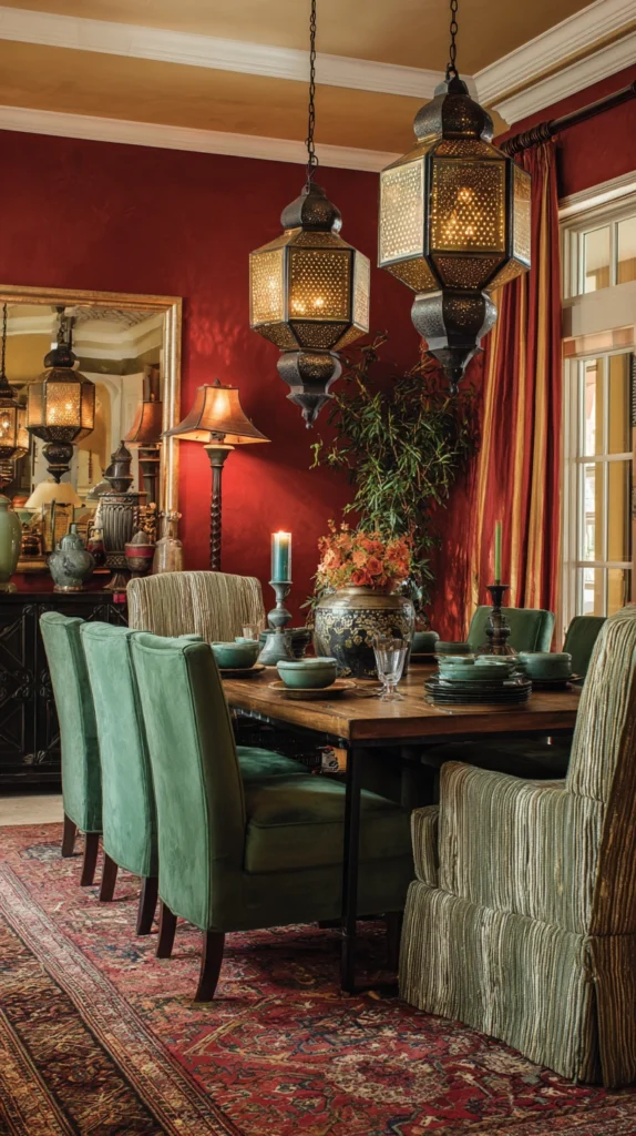
15. Morocco Inspired Football Style Palette
Morocco combines richness with warmth.
Use:
- Deep red
- Green
- Gold or brass accents
This creates a cozy and slightly exotic feel. Add lantern-style lighting or textured fabrics.
Tip: Use warm lighting to enhance the colors.
Tips to Make Your Dining Room Look Pinterest-Worthy
Keep your color palette simple. Choose 2 or 3 main colors and do not mix too many shades.
Use natural materials like wood, linen, and cotton. These textures make the space feel warm and real.
Lighting is very important. Warm lights make colors look softer and more inviting.
Add small decor items like vases, plants, or artwork that match your color theme.
Do not overcrowd the space. Leave some empty areas so the room feels open and calm.
Final Thoughts
Using football-inspired color palettes is a creative way to design your dining room. Each country brings its own feeling, from bold and energetic to calm and minimal.
You do not need to copy everything exactly. Just take inspiration from these colors and adjust them to your space. Start with small changes like cushions or wall art, then build your design step by step.
In the end, your dining room should feel comfortable, welcoming, and full of personality. With the right colors, you can create a space that looks stylish and feels just right for everyday life.