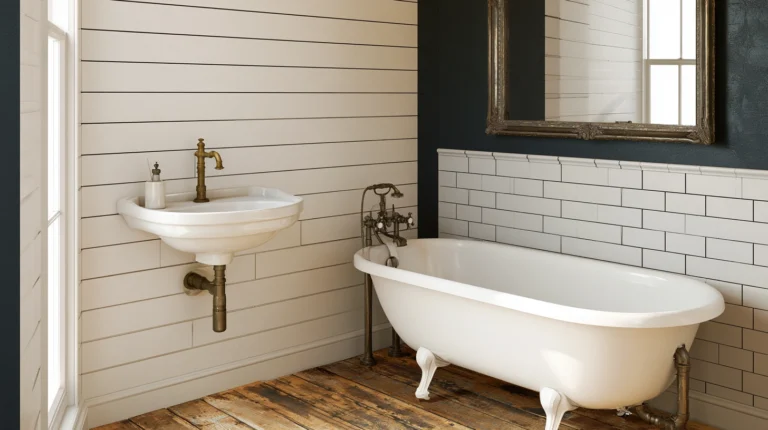
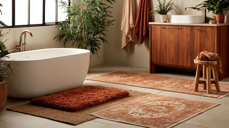
15 Moody Fall Bathroom Color Schemes to Try Now
15 Moody Fall Bathroom Color Schemes to Try Now
Most bathroom color advice points in one direction: light, bright, and as close to white as possible, on the logic that a small room needs all the help it can get to feel open. That advice works fine for a bathroom trying to look bigger than it is.
It says nothing for a bathroom trying to feel like fall. A moody color scheme — deep green, charcoal, burgundy, ink blue — does the opposite of what conventional bathroom advice recommends, and in a room this size, that’s exactly why it works. A small room wrapped in a single deep, confident color stops trying to disappear and starts feeling like somewhere worth spending time.

A moody bathroom isn’t simply a light bathroom painted a darker shade. It’s a different approach to the room entirely — one where the color is allowed to be the main event rather than a neutral backdrop, where metal finishes and lighting get chosen specifically to play off the wall color rather than just match the cabinetry. Done well, a moody scheme makes the smallest room in the house feel like the most deliberate one.
Here are 15 moody color schemes for a bathroom that actually wants to feel like the season outside.
Why Moody Bathroom Color Plays by Different Rules Than Bright, Airy Bathroom Color
The rules are not the same for every bathroom color direction:
Bright, Airy Bathroom Advantages:
- Reads as larger and more open, regardless of the room’s actual square footage
- Forgiving of imperfect lighting, since white and pale tones reflect whatever light is available
- Broadly neutral, with almost no risk of feeling dated or polarizing
The bright, airy comparison: safety and perceived space
Moody Bathroom Advantages:
- A genuine sense of atmosphere and intention that a neutral palette can’t provide
- Color that hides water spots, soap scum, and daily wear far better than white or pale surfaces do
- A strong, specific identity that makes the room memorable rather than simply clean
The key insight:
- A bright bathroom rewards reflecting whatever light exists
- A moody bathroom rewards working with the light it has, using accent metals and fixtures to do the brightening instead of the wall color
- These are different color philosophies, not the same room with a darker paint can
The Light and Sheen Reality
The most important consideration in moody bathroom color:
The available natural light:
- A bathroom with strong natural light can support a darker, more saturated color than a windowless or artificially lit one
- A truly dark, low-light bathroom needs deliberate compensating light sources before committing to the moodiest end of any palette
- Know this — it governs how far into “moody” any individual bathroom can actually go
The “sheen over shade” calculation:
- Paint sheen matters as much as paint color in a humid room — a flat finish on a dark color shows water spots and absorbs what little light there is
- A satin or eggshell sheen reflects more light than flat or matte, while still hiding wall imperfections better than a high-gloss finish would
- Choose the deepest color the room’s lighting can support, then choose the sheen that makes that color actually work day to day
Most moody bathroom schemes build in layers, not all at once:
- The wall color comes first, since every other decision gets measured against it
- The metal and hardware finish comes next, chosen specifically to either contrast or blend with the wall color
- The smallest accent layer — towels, a candle, a small print — comes last, and is the easiest layer to adjust seasonally without repainting anything
1. Deep Forest Green and Warm Brass (The Classic Moody Pairing)
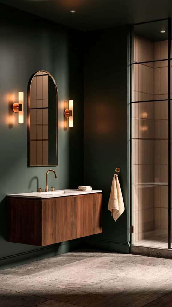
A saturated forest or hunter green on the walls, paired with warm brass fixtures and hardware — the most widely recognized moody bathroom combination, and the one most forgiving of a wide range of existing tile and flooring.
Why this pairing has become the default moody choice for good reason
- The warmth brass adds to a cool color: green is a cool-leaning color even in its deepest, richest shades, and warm brass keeps the overall room from feeling cold or sterile
- The natural-material pairing it invites: forest green sits comfortably alongside wood vanities, stone counters, and woven textiles, making it one of the easier moody colors to build a full room around
- The flattering effect on most existing fixtures: green is one of the few deep colors that complements both warm white and bright white porcelain fixtures, reducing the risk of a clash with whatever’s already installed
The options
- A true hunter or forest green, the deepest, most saturated version of this scheme
- A slightly muted sage-leaning deep green, for a softer, less intense version of the same pairing
- Green on a single accent wall, paired with a lighter neutral on the remaining walls for a less committed version
- Green cabinetry instead of green walls, concentrating the color on the vanity rather than the full room
The practical execution
- Choose a satin or eggshell sheen for the walls, which holds up to bathroom humidity while still reflecting enough light to keep the deep green from reading as flat or murky
- Pair with brass in a warm, slightly aged finish rather than a bright, polished brass, for a softer overall look
- Test paint swatches at different times of day before committing, since green shifts noticeably between natural and artificial light
Cost breakdown
- Paint, one gallon: $35–60
- Brass hardware swap (towel bar, hooks, pulls): $60–150
- Total: $95–210
The forest green wall catching brass-warmed light at dusk: the pairing responsible for more moody bathroom inspiration photos than any other single combination.
2. Charcoal and Warm Wood (Moody Without Committing to a Bold Color)
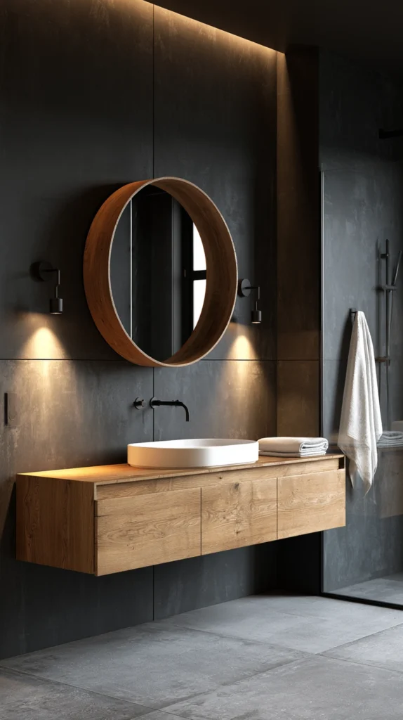
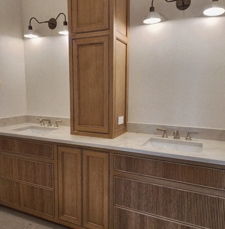
A deep charcoal or near-black on the walls, balanced by warm-toned wood accents — vanity, shelving, a wood mirror frame — the scheme for anyone who wants the drama of dark without introducing an actual hue.
Why charcoal reads as moody without reading as colorful
- The neutral-but-dramatic balance it strikes: charcoal delivers the same sense of depth and atmosphere as a saturated color, while still functioning as a neutral that’s easy to build other decisions around
- The warmth wood specifically provides against a cool gray: charcoal alone can feel cold or industrial, and warm wood tones counter that directly, the same way brass counters green in Idea #1
- The long-term flexibility it offers: because charcoal isn’t tied to a specific seasonal color the way green or rust can feel, this scheme transitions easily from fall into winter without feeling out of place
The options
- A true charcoal gray, leaning warm rather than blue-toned, for the best pairing with wood
- A near-black, for the most dramatic version of this scheme
- Charcoal on the lower half of the wall with a lighter color above, using a chair rail or simple paint line to split the difference
- Charcoal tile instead of paint, for a more permanent, moisture-resistant version of the same look
The practical execution
- Choose a warm-toned charcoal rather than a cool, blue-gray version, since warm charcoal pairs far more naturally with wood tones
- Add at least one substantial wood element — a vanity, a large mirror frame, open shelving — rather than relying on small accents alone to provide the counterbalance
- Use a satin sheen to keep the deep gray from feeling flat or absorbing too much of the room’s available light
Cost breakdown
- Paint, one gallon: $35–60
- Wood vanity or shelving accent, if adding new: $150–500
- Total: $35–560, depending on whether wood elements already exist in the room
3. Burgundy and Matte Black (Rich, Romantic, and Distinctly Autumnal)
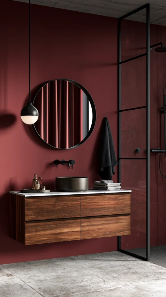
A deep wine or burgundy wall color, paired with matte black fixtures and hardware — one of the more dramatic schemes on this list, and one of the most specifically tied to fall and winter’s color palette.
Why burgundy carries more seasonal specificity than most moody colors
- The direct color association with fall itself: burgundy reads as more explicitly autumnal than charcoal or navy, evoking wine, dried leaves, and the deepest part of the season’s natural palette
- The drama matte black adds rather than softens: unlike brass, which warms a scheme, matte black intensifies burgundy’s richness, leaning fully into the room’s moodiest potential rather than balancing it
- The jewel-tone elegance it offers: of all the colors on this list, burgundy is among the most likely to read as genuinely elegant rather than simply dark, particularly in a powder room or guest bathroom meant to make an impression
The options
- A true wine or burgundy, the most saturated version of this scheme
- A muted, dustier burgundy, leaning slightly brown for a softer take on the same color family
- Burgundy on a single feature wall, paired with a lighter neutral elsewhere for a less committed version
- Burgundy grasscloth or textured wallpaper, for added depth beyond what flat paint alone provides
The practical execution
- Reserve this scheme for a bathroom with reasonably good lighting, natural or artificial, since burgundy is one of the deepest, most light-absorbing colors on this entire list
- Pair with matte black fixtures consistently throughout, rather than mixing in a warmer metal, to keep the scheme’s dramatic intensity intact
- Test the exact shade carefully before committing, since burgundy can shift toward either red or brown depending on the room’s specific lighting conditions
Cost breakdown
- Paint, one gallon: $35–65
- Matte black hardware swap: $60–150
- Total: $95–215
4. Navy and Aged Brass (A Cooler, More Tailored Moody Direction)
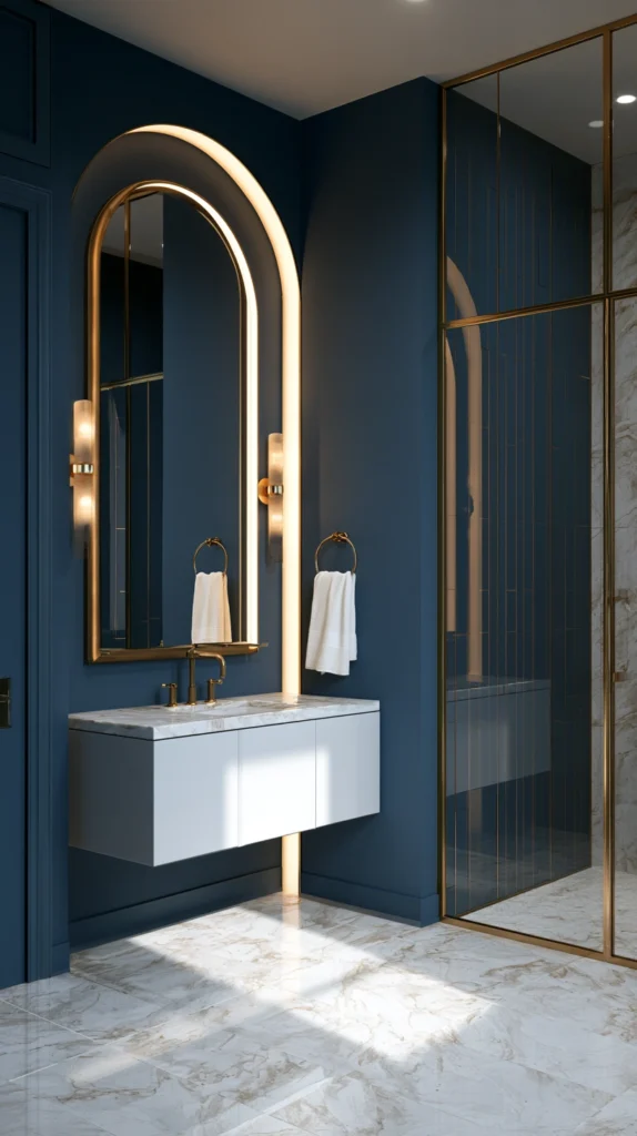
A deep navy wall color, paired with aged or antique brass fixtures — a scheme that leans more tailored and classic than some of the more rustic or romantic options on this list.
Why navy occupies a distinct lane among moody color choices
- The tailored, almost nautical association it carries: navy reads as more structured and considered than green or burgundy, fitting a bathroom aiming for a slightly more formal moody look
- The cooler base it provides, balanced against warm metal: like the forest green in Idea #1, navy is a cool color that benefits significantly from a warm metal counterpoint
- The strong pairing with white or marble accents: navy is one of the few colors on this list that looks equally striking against a crisp white vanity or true marble counter as it does against wood
The options
- A true navy, deep and fully saturated
- A navy leaning toward black, for an even moodier, more dramatic version
- Navy on cabinetry, with a lighter wall color, for a scheme concentrated on the vanity rather than the full room
- Navy grasscloth wallpaper, adding texture and depth beyond flat paint
The practical execution
- Choose an aged or antique brass finish rather than a bright, polished one, for a softer overall pairing than the crisp brass-and-navy combination sometimes seen in more formal interiors
- Pair with white or marble-look counters and fixtures wherever possible, since the contrast is one of this scheme’s strongest visual assets
- Use a satin sheen for durability and light reflection, the same recommendation as most other deep colors on this list
Cost breakdown
- Paint, one gallon: $35–65
- Aged brass hardware swap: $70–160
- Total: $105–225
5. Terracotta and Charcoal (Warmth and Depth in the Same Room)
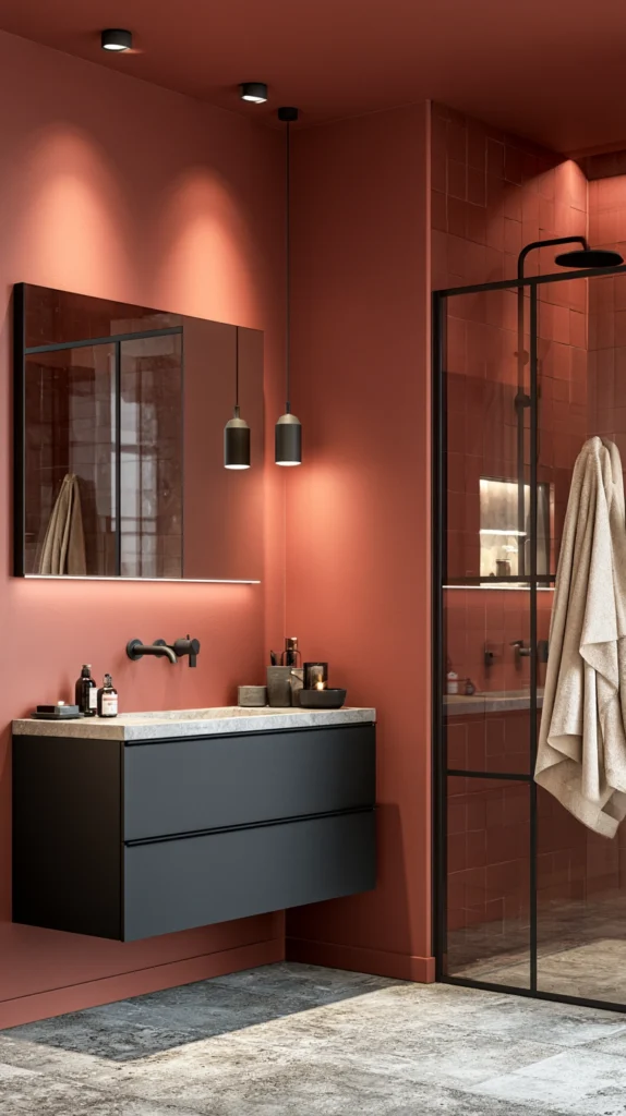
A warm, earthy terracotta on the walls, balanced by charcoal accents in tile, hardware, or cabinetry — a scheme that brings genuine warmth into a moody palette rather than leaning entirely cool or dark.
Why this pairing avoids feeling as heavy as some other moody schemes
- The warm-toned alternative it offers: every scheme covered so far leans cool or jewel-toned; terracotta provides a genuinely warm option for anyone who wants moody depth without the room feeling cold
- The earthy, harvest-season association: terracotta reads directly as autumnal in a different way than burgundy does, closer to clay, dried clay pots, and late-season sun than to wine or dark fruit
- The charcoal balance it needs to avoid feeling too warm or too busy: terracotta alone can start to feel more rustic-casual than moody; charcoal grounds it back into the same dramatic register as the rest of this list
The options
- A true terracotta, the most saturated, clay-toned version of this color
- A muted, dustier terracotta, leaning closer to a warm clay-pink for a softer take
- Terracotta tile on the floor or as a backsplash, with charcoal walls, reversing which element carries which color
- Terracotta on a single accent wall, paired with charcoal cabinetry or charcoal tile elsewhere in the room
The practical execution
- Pair terracotta with matte black or charcoal fixtures specifically, rather than a warm metal, to keep the overall scheme from tipping too far into a purely warm, less moody direction
- Use natural materials — wood, stone, woven textiles — to reinforce the earthy quality terracotta is already introducing
- Choose a satin sheen, consistent with the rest of this list’s recommendations for humidity and light reflection
Cost breakdown
- Paint, one gallon: $35–60
- Charcoal accent hardware or tile: $60–200
- Total: $95–260
6. Espresso Brown and Cream (Moody Without a Single Cool Tone)
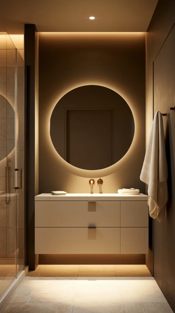
A deep, rich espresso brown on cabinetry or walls, paired with warm cream accents — a scheme built entirely from warm tones, avoiding the cooler jewel tones that dominate much of this list.
Why an all-warm scheme stands apart from the rest of this list
- The cozy, grounded feeling it creates: brown carries none of the drama-through-coolness that navy or charcoal rely on, instead leaning into warmth and familiarity as its source of moodiness
- The cream counterbalance it specifically needs: brown alone, especially in a small room, risks feeling heavy or cave-like; cream lifts the scheme just enough to keep it feeling intentional rather than overwhelming
- The strong pairing with brass or gold hardware: brown’s warmth extends naturally into warm metal tones, making hardware selection one of the more straightforward decisions on this list
The options
- Espresso brown cabinetry, paired with cream walls, concentrating the deepest color on the vanity
- Espresso brown walls, paired with cream trim and a white or cream vanity
- A two-tone wall, with brown on the lower half and cream above, divided by a simple painted line or trim
- Brown tile flooring, paired with cream walls for a reversed version of the same warm pairing
The practical execution
- Use cream rather than stark white for the counterbalancing color, since pure white can feel jarring and too cool against a warm brown
- Choose brass or warm gold hardware consistently, reinforcing the all-warm palette rather than introducing a cooler black or chrome accent
- Add a wood element if the scheme is concentrated mostly in paint, tying the brown wall color back to a tactile material in the room
Cost breakdown
- Paint, one gallon each of brown and cream: $70–120
- Brass or gold hardware: $60–150
- Total: $130–270
7. Black and White High Contrast (Moody Through Drama, Not Color)
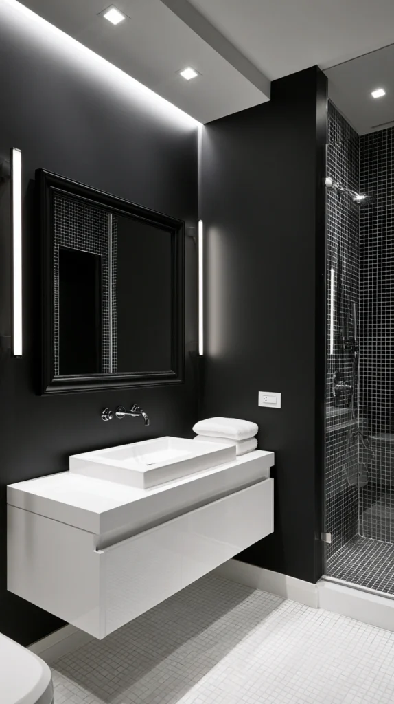
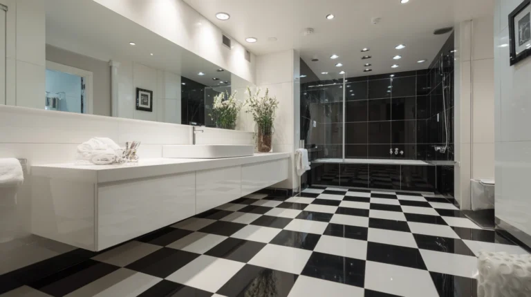
A bold black-and-white scheme — black walls or tile paired with crisp white fixtures and trim — proving that moody doesn’t require a saturated hue at all, just enough contrast and depth.
Why high contrast achieves the same mood without any color commitment
- The color-free path to drama: this scheme delivers real visual intensity without requiring a household to commit to green, burgundy, or any other specific hue they might tire of
- The timeless quality it offers over a trend-sensitive color: black and white doesn’t risk feeling dated the way a specific saturated paint color eventually can
- The flexibility for partial commitment: this scheme works as a full black room or as a much smaller black accent — a single wall, a vanity, a floor — against an otherwise white space
The options
- Full black walls, paired with white fixtures, trim, and counters for maximum contrast
- Black and white checkerboard or patterned floor tile, with white walls, concentrating the drama underfoot
- A black vanity, against white walls, for a more moderate version of the scheme
- Black wainscoting or a black lower half wall, paired with white above, splitting the contrast across the same wall
The practical execution
- Choose true black rather than a very dark charcoal if maximum contrast and drama is the goal, since charcoal softens the effect this scheme depends on
- Keep metal finishes simple — chrome, matte black, or brushed nickel — rather than introducing a warm metal that competes with the black and white’s inherent starkness
- Use this scheme’s high contrast to full advantage with strong, simple lighting, since black and white reads best under clean, well-considered light rather than dim or warm-only fixtures
Cost breakdown
- Paint, one gallon of black: $35–60
- Black and white patterned floor tile, if added: $300–900
- Total: $35–960, depending on how much of the scheme involves tile versus paint alone
8. Olive and Walnut (An Earthier, Quieter Take on Moody Green)
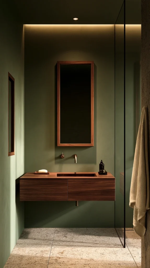
A muted, earthy olive on the walls, paired with rich walnut wood tones — a quieter, more understated version of the forest green pairing in Idea #1, leaning rustic rather than classic.
Why olive reads differently than the deeper greens already covered
- The muted, less saturated quality it offers: olive sits closer to a neutral than forest or hunter green does, making this a slightly gentler entry point into a moody green scheme
- The earthier, more rustic register it occupies: where forest green and brass lean toward a more polished, classic look, olive and walnut lean toward something closer to a cabin or farmhouse sensibility
- The strong pairing with natural, unpolished materials: olive works particularly well against raw or lightly finished wood, woven baskets, and stone, all of which reinforce its more grounded character
The options
- A true olive, muted and slightly grayed compared to a brighter green
- Olive on a single accent wall, paired with a warm white or cream elsewhere
- Olive tile, for a more durable, permanent version of the color
- A deeper, more saturated olive, edging closer to the forest green territory of Idea #1 for a more dramatic version
The practical execution
- Pair with walnut or another deep, rich wood tone specifically, rather than a lighter wood, to maintain the scheme’s overall moody depth
- Choose brass or black hardware depending on whether a warmer or cooler accent is preferred, since olive is flexible enough to support either direction
- Add woven or natural-fiber textiles to reinforce the earthier, more rustic quality this particular green carries compared to a more classic forest green
Cost breakdown
- Paint, one gallon: $35–60
- Walnut wood accent or vanity, if adding: $200–600
- Total: $35–660, depending on whether wood elements already exist
9. Plum and Matte Black (A Softer, More Unusual Jewel Tone)
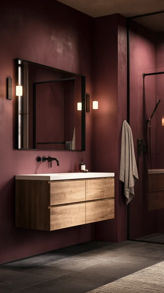
A deep plum or aubergine wall color, paired with matte black fixtures — a less common but increasingly popular jewel tone, sitting between the more familiar burgundy and navy options elsewhere on this list.
Why plum offers something the more common moody colors don’t
- The distinctiveness it provides: plum is less frequently used than green, navy, or charcoal in moody bathroom schemes, giving a room genuine visual distinction from the more commonly seen pairings
- The softness within its own depth: despite being a genuinely dark, saturated color, plum carries a slight softness that burgundy and navy don’t quite have, making it a less severe option for anyone hesitant about full commitment to a moody scheme
- The strong seasonal tie-in: plum sits naturally alongside fall’s other deep fruit and wine tones, fitting comfortably into an autumnal palette without being as explicitly “wine” as burgundy
The options
- A true plum or aubergine, deep and fully saturated
- A muted, grayer plum, for a softer, less intense version
- Plum on cabinetry only, paired with a lighter neutral wall color
- Plum velvet or textured wallpaper, adding tactile depth beyond flat paint
The practical execution
- Pair consistently with matte black rather than a warm metal, since plum’s slight coolness pairs more naturally with black than with brass or gold
- Test the color under the room’s actual lighting before committing, since plum can shift noticeably between looking purple and looking closer to a deep wine red depending on the light source
- Use a satin sheen for the same humidity and light-reflection reasons recommended throughout this list
Cost breakdown
- Paint, one gallon: $35–65
- Matte black hardware swap: $60–150
- Total: $95–215
10. Rust and Deep Teal (A Bold, Complementary Color Pairing)
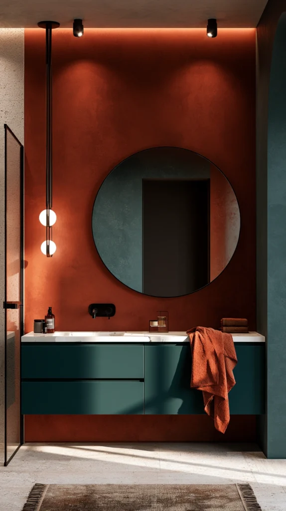
A burnt rust or sienna on one surface, paired with a deep teal on another — walls and cabinetry, or a wall and an accent tile — bringing two distinct saturated colors together rather than relying on a single hue and a metal accent.
Why this pairing works despite combining two strong colors
- The complementary color relationship it relies on: rust and teal sit roughly opposite each other on the color wheel, which means the pairing reads as intentional and balanced rather than clashing, despite both being fully saturated
- The most visually bold option on this entire list: for anyone who finds a single moody color too quiet, this two-color pairing delivers significantly more visual energy while staying within a cohesive, autumnal palette
- The flexibility in how the two colors get distributed: this scheme can be split evenly between two walls, concentrated with rust on the walls and teal on cabinetry, or reversed, depending on which color a given bathroom should lead with
The options
- Rust walls with teal cabinetry, concentrating the cooler color on the vanity
- Teal walls with rust accents, in towels, a tile inset, or a single piece of furniture
- A rust and teal tile pattern, for a more permanent, pattern-driven version of the pairing
- Rust on the lower half of the wall, teal on the upper, divided by a simple trim line
The practical execution
- Keep the ratio between the two colors intentionally uneven, leading clearly with one as the dominant color and using the other as a smaller accent, rather than splitting the room exactly in half
- Choose black or brass hardware based on which of the two colors is dominant, brass leaning into rust’s warmth and black grounding teal’s coolness
- Test both colors together under the room’s actual lighting before committing, since this is the highest-risk pairing on the list if the two tones don’t read well together in the specific light available
Cost breakdown
- Paint, one gallon each of rust and teal: $70–120
- Hardware: $60–150
- Total: $130–270
11. Slate Blue and Brass (A Cooler, Softer Alternative to Navy)
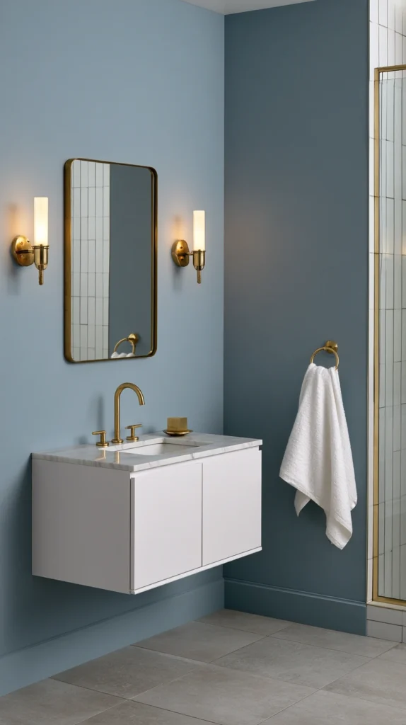
A muted slate or dusty blue on the walls, paired with brass fixtures — a gentler, less saturated alternative to the deep navy covered in Idea #4, for a bathroom that wants a cooler moody tone without going quite as dark.
Why slate offers a different entry point than full navy
- The reduced saturation it provides: slate blue sits further from black than navy does, making this one of the more approachable moody schemes for a bathroom with more limited natural light
- The same warm-cool balance principle as navy, executed more softly: like navy and brass, slate blue and brass rely on a cool base warmed by a metal accent, just at a gentler overall intensity
- The versatility across different bathroom sizes: because it’s less intensely saturated, slate blue tends to work in both larger and smaller bathrooms more comfortably than some of the deepest colors on this list
The options
- A true slate blue, gray-leaning and muted
- A slightly deeper dusty blue, edging closer to navy for more drama
- Slate blue on beadboard or wainscoting, paired with a lighter color above
- Slate blue tile, for a more durable, permanent version of the color
The practical execution
- Choose a warm or aged brass finish rather than a bright polished one, softening the overall pairing to match slate blue’s own more muted character
- Use this scheme in a bathroom with comparatively less natural light than might be needed for the deepest colors on this list, since slate blue’s lower saturation makes it more forgiving
- Pair with white or cream trim for definition and contrast, rather than letting the slate blue run uninterrupted from floor to ceiling
Cost breakdown
- Paint, one gallon: $35–60
- Brass hardware swap: $60–150
- Total: $95–210
12. Mushroom Greige and Matte Black (A Quiet, Sophisticated Neutral-Moody Hybrid)
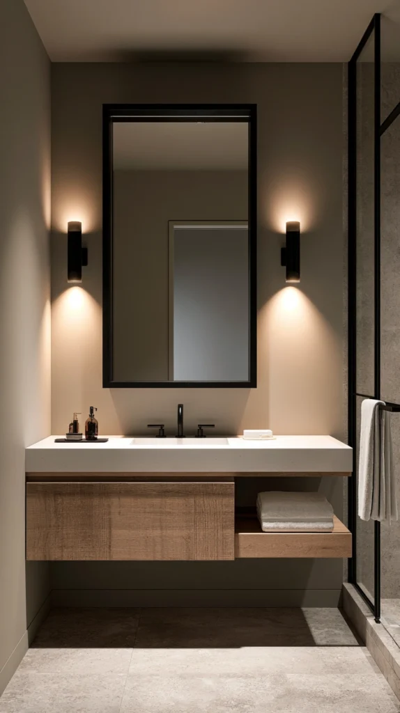
A warm, deep greige — somewhere between gray and a soft mushroom brown — paired with matte black fixtures, offering a more restrained option for anyone drawn to mood but hesitant about a fully saturated color.
Why a neutral can still deliver genuine mood
- The quiet sophistication it provides over a bolder color: greige delivers real depth and atmosphere without asking for the same level of commitment as green, burgundy, or teal
- The broad compatibility it offers: because it’s fundamentally a neutral, mushroom greige pairs easily with almost any existing tile, flooring, or fixture finish already in the room
- The longevity advantage: a neutral-leaning moody color is the least likely option on this entire list to feel dated or in need of a refresh within a few years
The options
- A warm, deep greige, the core of this scheme
- A cooler, more gray-leaning version, for a slightly more modern, less warm take
- Greige on walls with a contrasting white vanity, for a softer overall room
- Greige paired with black-framed mirrors and lighting, reinforcing the moody quality through fixtures rather than color alone
The practical execution
- Test swatches carefully, since greige is notoriously sensitive to lighting and can shift between looking warm, cool, pink, or green depending on the room’s specific light
- Pair with matte black for definition, since this neutral color benefits from a strong contrasting accent more than some of the boldest colors on this list do
- Use this scheme as a safer entry point for a household renovating a shared or resale-conscious bathroom, since it reads as considered without being as polarizing as a fully saturated color
Cost breakdown
- Paint, one gallon: $35–60
- Matte black hardware swap: $60–150
- Total: $95–210
13. Deep Mustard and Charcoal (A Bold, Less Common Warm Choice)
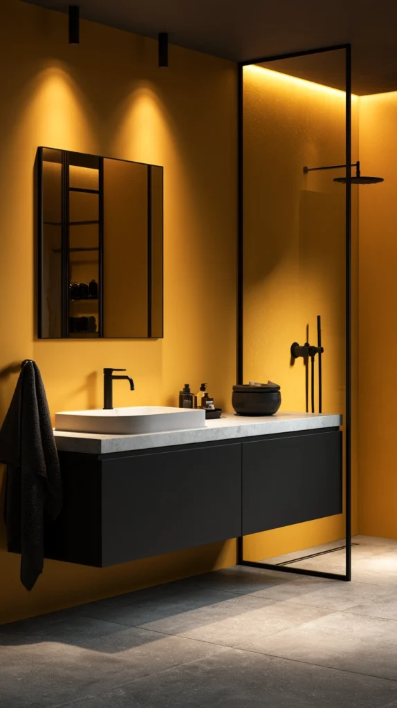
A rich, deep mustard or ochre on the walls, paired with charcoal accents — one of the less frequently used colors on this list, and one of the most distinctly tied to fall’s specific color palette.
Why mustard earns a place among the more common moody choices
- The direct seasonal association it carries: mustard reads as fall foliage and harvest color more specifically than almost any other option on this list
- The boldness it offers without leaning cool or jewel-toned: unlike navy, plum, or teal, mustard delivers real visual impact while staying firmly in a warm color family
- The charcoal pairing it specifically needs: mustard alone, especially in a fully saturated form, can feel overwhelming in a small room; charcoal grounds and tempers it the same way it does for terracotta in Idea #5
The options
- A true, deep mustard, the most saturated version of this color
- A more muted, dustier ochre, for a softer take on the same warm tone
- Mustard on a single accent wall, paired with charcoal or a neutral elsewhere
- Mustard tile, for a bolder, more permanent version of the scheme
The practical execution
- Use mustard sparingly relative to charcoal if the goal is a balanced room, since this is one of the most visually assertive colors on the entire list
- Pair with matte black or charcoal fixtures rather than a bright metal, to keep the scheme grounded rather than overly bright
- Test extensively under the room’s actual lighting, since mustard is particularly sensitive to whether the light source is warm or cool
Cost breakdown
- Paint, one gallon: $35–60
- Charcoal accent hardware or tile: $60–200
- Total: $95–260
14. Aubergine and Antique Gold (Maximum Drama for a Powder Room)
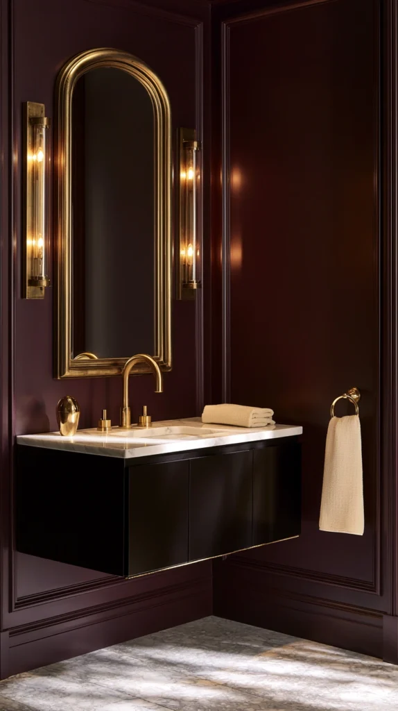
A near-black aubergine or deep eggplant purple, paired with antique gold fixtures — the most dramatic, most fully committed scheme on this entire list, best suited to a smaller powder room rather than a primary, heavily used bathroom.
Why this scheme works best at a smaller scale
- The intensity that benefits from a contained space: aubergine this deep can feel overwhelming in a large, frequently used bathroom, but reads as genuinely glamorous in a smaller powder room meant to make a quick, strong impression
- The gold pairing that matches the scheme’s overall drama: where the other warm-metal pairings on this list lean toward a softer aged brass, this scheme calls for a richer, more saturated antique gold to match aubergine’s own intensity
- The guest-facing logic: a powder room is seen briefly and by guests specifically, making it the natural home for the boldest, least everyday-practical color choice on this entire list
The options
- A near-black aubergine, the deepest, most dramatic version
- A slightly lighter eggplant purple, for marginally more daily livability
- Aubergine grasscloth or textured wallpaper, adding depth beyond flat paint
- Aubergine paired with a black vanity and gold fixtures, for the fullest version of the scheme
The practical execution
- Reserve this scheme specifically for a powder room or guest bathroom rather than a primary daily-use bathroom, given how intense it reads over extended exposure
- Invest in strong, well-placed lighting, since this is one of the darkest, most light-absorbing color choices on the entire list
- Pair with a single striking mirror or light fixture as a focal point, since the wall color alone is dramatic enough to need only one additional statement piece, not several competing for attention
Cost breakdown
- Paint, one gallon: $40–70
- Antique gold hardware and a statement mirror: $150–400
- Total: $190–470
15. Smoky Taupe and Bronze (The Most Wearable Moody Scheme on the List)
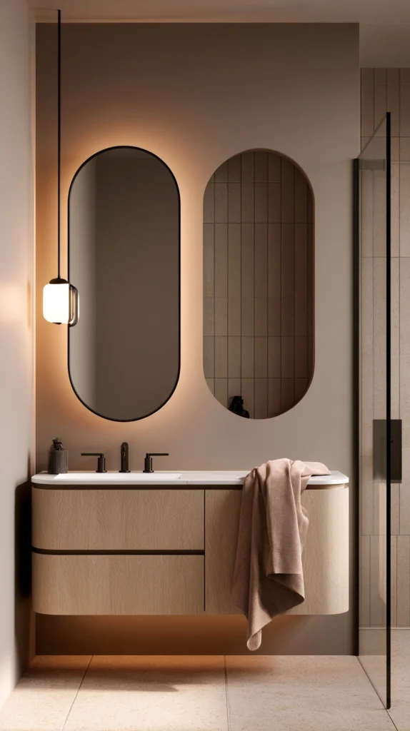
A soft, smoky taupe on the walls, paired with bronze fixtures — the gentlest, most broadly livable scheme covered here, suited to anyone who wants the atmosphere of a moody bathroom without much risk of tiring of it.
Why this scheme closes out the list as the safest full commitment
- The everyday livability it offers over the more saturated options: smoky taupe sits closer to a true neutral than nearly every other color on this list, while still carrying enough depth to read as genuinely moody rather than simply beige
- The bronze pairing’s understated warmth: bronze splits the difference between brass’s brightness and black’s starkness, reinforcing this scheme’s overall quality of being deliberately unassuming
- The resale and longevity advantage: of every scheme on this list, this is the one most likely to suit a household uncertain about committing to a bolder color, or concerned about future resale appeal
The options
- A warm, smoky taupe, the core of this scheme
- A cooler, more gray-leaning taupe, for a slightly different undertone
- Taupe paired with a white vanity, for a softer overall room
- Taupe tile flooring, paired with taupe or white walls for a more monochromatic version
The practical execution
- Test swatches under the room’s actual lighting, since taupe, like greige, is highly sensitive to whether a space reads warm or cool depending on the light source
- Pair with bronze fixtures consistently rather than mixing in a starker black or brighter brass, to preserve the scheme’s overall soft, understated character
- Use this scheme as the lowest-risk option on the list for a first attempt at moody bathroom color, since it offers genuine atmosphere with the least committal intensity
Cost breakdown
- Paint, one gallon: $35–60
- Bronze hardware swap: $60–150
- Total: $95–210
The smoky taupe wall catching warm bronze light at the end of the list: the scheme built specifically for anyone who wants everything moody color offers, without ever feeling like too much.
The Moody Bathroom Color Roadmap
The work, sequenced:
Phase One (the color decision):
- Choose between a cool jewel tone (forest green #1, navy #4, plum #9, teal-rust #10), a warm tone (terracotta #5, espresso #6, mustard #13), or a neutral-moody hybrid (charcoal #2, greige #12, taupe #15)
- Test the chosen color under the room’s actual lighting at different times of day
Phase Two (the metal and hardware finish):
- Select brass, black, gold, or bronze based on which color was chosen in Phase One
- Swap towel bars, hooks, pulls, and the faucet to match
Phase Three (the supporting materials):
- Add wood, stone, or woven texture to reinforce the scheme’s warmth or coolness
- Confirm existing tile and flooring genuinely work with the new wall color before painting the full room
Phase Four (the accent layer):
- Layer in towels, a candle, and a small print or mirror that echo the scheme’s overall palette
- Adjust lighting if the chosen color is on the deeper, more light-absorbing end of this list
Getting Started This Weekend
The immediate-impact color test:
One weekend, three changes:
- Paint a single accent wall in the chosen color, rather than committing the full room at once (almost any idea on this list)
- Swap just the towel bar and a few hooks to the matching metal finish (Idea #1, #4, #9, or others)
- Add new towels and a candle in the scheme’s palette (any idea on this list)
Total cost: $90–180. Time: an afternoon. The room will already signal its new direction clearly enough to judge whether the full scheme is worth committing to.
The structural investment (the next big project):
Choosing and committing to the full paint color, walls and trim both, is the single decision every other idea on this list depends on. Once it’s chosen and tested under the room’s real lighting, the hardware, the textiles, and the smaller accents all have a fixed point to coordinate against, rather than guessing at a color that hasn’t actually been lived with yet.
What a moody fall bathroom provides that a bright, neutral one can’t:
The atmosphere that comes from commitment, not caution:
- A wall color allowed to be the room’s main event, rather than a safe backdrop
- Metal finishes chosen specifically to play off the color, not just match the fixtures
- A small room that feels deliberate instead of apologetic about its size
The practicality that comes as a bonus, not the main goal:
- Deep color that hides water spots and daily wear better than white ever could
- A satin sheen doing double duty as both light reflection and humidity protection
- A scheme that, chosen well, doesn’t need to be redone every time trends shift
The range that means there’s a version of this for every bathroom:
- A deep, fully committed jewel tone for a powder room built to impress
- A softer neutral-moody hybrid for a primary bathroom used every single day
- A two-color pairing for anyone who finds a single hue too quiet
A moody bathroom was never really about making the room darker. It’s about letting a small space have a real point of view instead of trying to disappear into a safe, forgettable neutral. The forest green wall painted on a Saturday afternoon is still doing its job on a gray December morning, long after the leaves outside have gone. The brass hardware chosen to match it is the reason the whole room reads as intentional, not just dark.